Pages

Sunday, August 4, 2013

What Is Lidar?

What Is Lidar?


Sunday, July 28, 2013

Secretly mapping the sea floor

Secretly mapping the sea floor                       
NGA map for Cuba
with data collected by U.S. Navy

From SantaCruzSentinel

The oceans of Earth host creatures as large as Blue whales and microscopic as plankton.
Beneath the surface is a landscape of mountains, valleys and plains.

Monterey Bay Submarine canyon

The Monterey Bay National Marine Sanctuary between Marin County and northern San Luis Obispo County, for instance, has the Monterey Bay Submarine canyon that plunges a mile beneath the bay floor and the Davidson Seamount, nearly 7,500 feet tall though its peak is 4,000 feet below the ocean's surface.

Only about 10 percent of the ocean floor is mapped with the precision that dry land is.
Anyone with access to the internet can find maps developed with methods that have evolved in sophistication since the 1800s, from line and sinker to sophisticated sonar.
Some work has been done by private institutions and government agencies charged with ocean management.


But some was done in secret by the U.S. military including the period known as the "cold war" between the U.S. and the Soviet Union that started after World War II and ended when the former collapsed in 1991.
The Navy's involvement started in 1849, producing maps of the North Atlantic by 1853, and international charts that were published in 1905.
The military's mapping slowed during World War II but was re-engaged in the late 1940s.
Sea floor maps provided strategic information for both the U.S. and Soviet Union in the case of, for example, submarines which were equipped with long-range nuclear missiles.

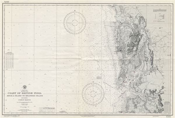
1945 World War II (WWII) U. S. Navy Map or Nautical Chart of Bombay Harbor, India
NGA chart Mumbaï in the Marine GeoGarage

Terri Morgan, an author and journalist who writes occasionally for the Sentinel, credited the work done in secret by her late father Joseph Morgan and others in the Navy as advancing our understanding of the ocean and the sea floor.
"Since most of the projects my dad was involved in were during the cold war, a lot of his work was classified," she said.
"So it's difficult to find a lot to verify the family stories. But the gist of it all is that the Navy did do a lot of ocean floor mapping during the cold war."

Physiographic Diagram, Atlantic Ocean
(Heezen, Bruce C.; Tharp, Marie)

After Joseph Morgan participated in the effort to in map the Atlantic he was transferred to the Pacific where his focus was on tracking Soviet submarines.
"There was a series of naval stations along the coast, including Centerville Beach, where he was stationed in 1968 and 1969, Point Sur, and Coos Bay, Oregon that were involved in the same project," Terri Morgan remembered.


Joseph Morgan retired as a captain in the Navy in 1974.
His daughter said he embarked on a second career as a professor at the University of Hawaii and worked on several books.
"His works included The Atlas for Marine Policy in the Southeast Asian Sea which includes maps that focus on the seafloor and not the continents," she told me.
"He also worked on the Ocean Yearbook. He never lost his fascination with the ocean."

"Like most military innovations, war was a good motivator for advancing technology," she said.
The internet, which itself has origins in a Department of Defense project, made large amounts of data readily available worldwide.
The internet search engine Google launched Google Earth which now includes sea floor images based on work done by people such as Joseph Morgan.

To learn how sea floor mapping has evolved over the years, go to NOAA

Wednesday, July 24, 2013

Nursing Home Tracks Residents' Every Move

Nursing Home Tracks Residents' Every Move
        

Nursing Home "Marauder's Map"
     
Nursing Home "Marauder's Map" Sadly, there's no room of requirement listed. Carnegie Mellon
Using security cameras and algorithms, researchers at Carnegie Mellon created a nursing home monitoring system that "located individuals within one meter of their actual position 88 percent of the time." That's great news for people who want to be monitored all the time. For people who prefer to go about their business unobserved, it's another step toward a perfectly tracked future.
The system was inspired by the person-tracking Marauders' Map featured in Harry Potter books, and it's called multi-camera or multi-object tracking. Previous attempts at multi-object tracking have had limited success, accurate either one third or one half the time. But those systems were tested in tightly controlled labs. Carnegie Mellon decided to try a more organic environment. A nursing home is a great testing environment, the researchers say: cameras already exist and have to deal with realistic obstacles like inconvenient furniture placement, doors getting in the way, blind spots, and residents moving freely. It's also good because a tracking system in a nursing home reads as altruistic - it's important to be able to find and care for the elderly as soon as they might need assistance.
The technology works through a combination of facial recognition and color tracking. Colored clothing is a good way to identify people, because it is visible most of the time, but the same color shirt can look different under different lighting. Algorithms compensate for differences in color appearance under different light--they make it so that you can track someone wearing a red shirt as he moves from a dark hall to a brightly lit dining room. Facial recognition is the best way to identify people, but faces are rarely pointed directly at cameras, so it only works about 10 percent of the time.
That's why it's important to track both faces and colors at the same time. The process resembles how cell phones pinpoint personal location with different inputs. Signals sent to cell towers provide a constant, rough idea of where the phone user is, and occasionally a GPS double-checks the position and corrects it if need be.
Carnegie Mellon's program isn't yet ready for prime time. The researchers used 6 minutes of footage recorded by 15 cameras in a nursing home in 2005 to develop the algorithms and test the system. A live trial is still a long way off, but once the system completes identification in a real-time setting, expect it to move from nursing homes to prisons to casinos and then everywhere.
People wanting to say hidden from this might just turn to facial-recognition-thwarting makeup.

[Kurzweilai.net]

Mapmaker Satellite TanDEM-X's

3-D Map-Making TanDEM-X Satellite Returns First Images, Showing Fine Detail of Earth's Surface

The Worst Places To Live In The Universe


The Worst Places To Live In The Universe 


Seafloor Mapping

Seafloor Mapping

Bob Embley
Geophysicist
NOAA, Pacific Marine Environmental Laboratory


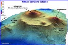
Three-dimensional image of Nikko Submarine Volcano
Nikko submarine volcano has two summit cones within the remnant of a large circular caldera, which has been subsequently filled by eruptive material.


Producing maps of the seafloor has always been a particular challenge to humankind. The first primitive maps came from successions of single soundings produced by lowering weighted lines into the water and noting when the tension on the line slackened. By measuring the amount of line paid out, one could determine the depth. These early maps gave only the most general picture of the ocean floor, and only the larger features could be identified by looking for patterns in many such soundings. Most of these surveys were conducted to identify near- shore hazards to shipping. Only in the late nineteenth century did expeditions begin to take large numbers of soundings in deep water.

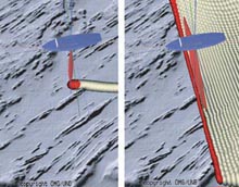
Single and multibeam sonar
 
Comparing single (left) and multibeam (right) echo sounding of the seafloor. The multibeam method is preferred because it measures an entire area rather than a single line of seafloor.


The first modern breakthrough in seafloor mapping came with the use of underwater sound projectors called “sonar,” which was first used in World War I. By the 1920s, the Coast and Geodetic Survey (the predecessor agency to NOAA’s National Ocean Service) was using sonar to map in deep water. The team of A. C. Veatch and P. A. Smith produced one of the first detailed maps of the ocean floor. This map showed that the canyons off the East Coast of the United States extended into very deep water.
During World War II, advances in sonar and electronics led to much improved systems that provided precisely timed measurements of the seafloor in great water depths. These systems provided the databases used to construct the first real maps of important features, such as the deep-sea trenches and mid-ocean ridges. The 1957 publication of Heezen and Tharp’s physiographic map of the North Atlantic was the first map of the seafloor that allowed the general public to begin to visualize the ocean floor. These early maps based on hundreds of thousands of hand-picked depths provided the context for the plate tectonics revolution in the 1960s that finally gave scientists satisfying explanations for the formation of mid-ocean ridges, trenches, mountain ranges and the “ring of fire” around the Pacific.

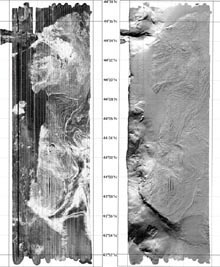
Heceta Bank Simrad EM 300 backscatter and topography
 
Heceta Bank Simrad EM 300 backscatter (left) and topography (right) on 10m grids. The backscatter image reveals seafloor physical properties and texture of the seabed. White areas depict cobble, boulder and sand areas. Black areas depict muddy areas.


Still, these systems only produced depth soundings immediately below the ship’s tracks. To produce maps of the shape of the seafloor, one had to laboriously “contour” an area by connecting lines of equal depth together. Although the advent of digital computers in the 1960s provided much needed automation for plotting data, the civilian scientific community was still using the same basic technology until the 1970s.
In the 1960s, the U. S. Navy began using a new technology of “multibeam sonar." Arrays of sonar projectors produced soundings not only along the track, but also for significant distances perpendicular to the ship’s track. Instead of lines of soundings, these new multibeam systems produced a swath of soundings. Combined with automated contouring, the ability to make detailed, complete maps of large areas of the seafloor became available to the scientific community for the first time in the late 1970s after the Navy declassified the technology. Since these first multibeam systems, this technology has steadily improved, and modern systems can map swaths up to several times the water depth. Combined with positional information gained by the geographic positioning navigation systems and advanced computer graphics, these systems now provide a whole new view of the seafloor.

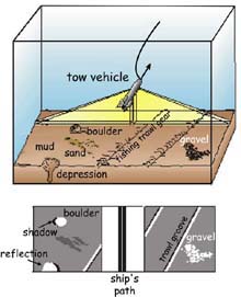
Sidescan sonar towed instrument and the sidescan data
 
Schematic diagram of a sidescan sonar towed instrument scanning the seafloor (top) and the sidescan data record created (bottom).


Knowing the shape of the seafloor is critical to advancing our knowledge of the ocean. It is also critical that we map changes in the composition of the seafloor. However, whereas the depth can be measured using the timing of the signals going to and from the seafloor, a precise measurement of the “strength” of the sonar return is needed to determine the texture of the seafloor. For example, a sound pulse impinging on a mud seafloor will be mostly absorbed with only a small percentage returning to the receiver. But a rock bottom will absorb very little sound and return most of it. In this way, modern seafloor survey systems measure relative strength of signal return as well as the depth. The record that results consists of a pattern of variable strength signal returns that illustrate the seafloor’s composition.
An alternative method of mapping the texture of the seafloor is provided by a “sidescan sonar” system. These systems are towed on cables, and send and receive sound signals over a broad swath of seafloor. The sonar arrays are positioned in such as way that they project sound at low angles. The resulting record can detect very subtle features by the acoustic “shadows” that are cast. Depending on the pitch of the system (low pitch sound travels farthest), sidescan sonar can cover hundreds of meters to kilometers of seafloor.
Using a sonar array mounted on the hull of a research vessel to map the seafloor has advantages. The vessel can travel at about 10 knots (~18.5 km/hr). It is very stable, and the data is generated in near real time and can be processed into useable maps very quickly. However, as the water depth increases, the “footprint” of the beams generated by the sonar become larger, similar to the spreading out of the beam of a flashlight with distance. Because the sonar averages the echo return across each beam to generate a depth point, the spreading out of the beams decreases the resolution of the resulting map. With increasing depth, there is an another limitation as well. The higher frequency sound needed to generate very accurate maps increasingly loses energy (“attenuates”) as it passes through more and more water.

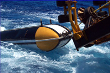
The MR1 towed a long-range sidescan sonar system
 
The MR1 towed long-range sidescan sonar system, which will be used to map the submarine volcanoes in the Marianas arc. Image courtesy of Hawaii Mapping Research Group. For more information about the MR1 system.


During the Submarine Ring of Fire project in 2003, we will be using a towed long-range sidescan sonar system called MR1 to map the submarine volcanoes in the Marianas arc. The MR1 sonar will be towed behind the ship at a depth of about 100 meters, while the ship travels forward at 9 knots. The MR1 data will help us understand the recent history of each volcano by revealing lava flows, landslides, and faults. MR1 is operated by the Hawaii Mapping Research Group at the University of Hawaii. While we are surveying with MR1, we will also be collecting bathymetric data with the R/V Thompson's EM300 multibeam sonar system. This bathymetry will show the shape and depth of each surveyed submarine volcano. It will be very important for conducting our CTD/plume-mapping operations this year and will help us plan our remotely operated vehicle dives to some of these volcanoes next year.

http://oceanexplorer.noaa.gov/explorations/03fire/background/mapping/mapping.html

Monday, July 22, 2013

Picturing science: Mapping the moon

Picturing science: Mapping the moon

Posted by 
Tuesday 11 June 2013 08.25 BST
 
A reproduction of a lunar map by H. Percy Wilkins, a "proto-Patrick Moore", is on display at the National Maritime Museum. It makes an interesting side-show to the new major exhibition, Visions of the Universe
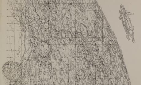
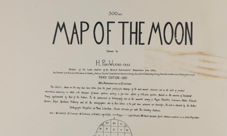
Map of the Moon by H. Percy Wilkins
A sheet from the 1951 edition of H. Percy Wilkins' Map of the Moon. Source: National Maritime Museum
Given my recurring Picturing Science posts in this blog, I can't avoid mentioning the new exhibition that has opened at the National Maritime Museum, Visions of the Universe. (Full disclosure: I have not been involved with this exhibition at all.) It has been getting some really nice reviews and previews, and anyone with an interest in astronomy or photography should make the trip.
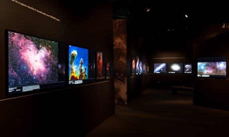
In this post, though, I want to highlight something else that is currently on view, within the main (free) museum. While the exhibition showcases what the space age has brought us, with extraordinary Hubble-type images and – the real hit, I think – a 13-metre long Mars Window, this other display offers the clearest possible reminder of how recently it is that any of this became possible.
Visions of the Universe exhibition at the National Maritime Museum Visions of the Universe: the new exhibition at the National Maritime Museum. Source: National Maritime Museum
In the NMM's Compass Lounge (at the rear left of the Museum's new entrance foyer), the several sheets of a 1951 map of the moon have been photographed and reproduced to show the complete 300-inch chart. It shows an extraordinary level of hand-drawn detail, achieved by its maker, H. Percy Wilkins (1896-1960), with the aid of distinctly earth-bound telescopes.
This map, versions of which he had been working on since the 1920s, was the largest-scale and most detailed of its time, combining Wilkins' personal observations with data from the drawings, photographs and measurements of other astronomers. As his Wikipedia entry says, it was "considered by some as the culmination of the art of selenography prior to the space age". Wilkins himself described it as "the World's greatest Moon Map".
The map was also, perhaps, one of the last productions of its kind. Not only was it published just on the cusp of the space age, but it was also the project of an amateur, working from his home near Bexleyheath with a 12½-inch, and later a 15½-inch, reflector. Wilkins did the work in his spare time, being employed first as a mechanical engineer and then a civil servant at the Ministry of Supply.
Title page of Wilkins' Map of the Moon The title page of Wilkins' Map of the Moon. Source: National Maritime Museum
Wilkins nevertheless found time to make telescopes, publish several works on popular astronomy and act as director of the British Astronomical Association's Lunar Section. As well as founding the Section's periodical The Moon, he was also, late in life, the first president of the International Lunar Society.
Two of Wilkins' books were co-authored with another selenographic authority, Patrick Moore, to whom the Visions of the Universe exhibition is dedicated. I found online a reminiscence of Wilkins by an acquaintance describing him as a "proto-Patrick Moore", but he was perhaps also a direct inspiration. In an obituary of his colleague, Moore wrote of the "prodigious amount of work" that went into the mapping project but, also, that "his personal enthusiasm was inspiring". Moore felt a "deep sense of personal loss".
Wilkins did not quite become the media star that Moore did, but he made "numerous broadcasts and television appearances". You can, for example, see him (his telescope, his map, and his daughter) here in a 1953 Pathé newsreel. Somewhat more infamously, he made the news in 1954 when he announced his observation of "the most extraordinary feature known on the moon today".
This was a curved shadow, already spotted and described as bridge-like by an American astronomer, John J. O'Neill. It was reported as a 20-mile arch, which can be seen clearly in the photographs reproduced in one of the newspaper reports, viewable at the bottom of the page here. It was, however, no more than a trick of the light, rather like the Face on Mars.
The episode seems to have damaged his credibility considerable and may be one of the reasons that he is less than well-remembered today. Part of the problem was that Wilkins spoke to the press and on the radio before submitting his, rather more cautious, observations to peer scrutiny, His case was not aided by his initially appearing to hint that the structure could be evidence of life on the moon: phrases like "looks artificial" and "almost like an engineering job" led some to leap to such conclusions, even if they were simply descriptive.
The "bridge" was not included in Wilkins' map, although it did incorporate some other erroneous details. Nevertheless, NASA purchased at least one, and possibly several, copies of the reduced reproduction of his lunar chart when preparing for the Apollo moon landings. His map was also used to help match up the first photographs of the far side of the moon, produced by a Lunar 3 in 1959, with features visible from Earth.
As well as the originals of three editions of the maps themselves, the Museum also received a number of notebooks, all kindly donated by Wilkins' daughter. The notebooks include formulae, photographs, newspaper cuttings, original drawings and observational notes, from Wilkins' Kentish observatory and visits to professional observatories in France and the US. They are testament to his years of dedicated work.
When you go (as you must) to see the images, the ingenuity and the leaps that have been made in professional and amateur astronomical imaging on display in the major exhibition, do also remember to pop over to see "the World's greatest Moon Map".

Navigating 18th-century science: Board of Longitude archive digitised

Navigating 18th-century science: Board of Longitude archive digitised

Posted by     Thursday 18 July 2013 07.47 BST

Today the complete archive of the Board of Longitude is being launched online, with stories of innovation, exploration and endeavour - and much more than just John Harrison
Design for a marine chair
Design for a marine chair submitted to the Board of Longitude. Source: Cambridge University Library
Today Lord Rees will be launching the digitised archive of the Board of Longitude at Cambridge University Library. Stuffed full of the correspondence and work of those who preceded him as Astronomer Royal, it also contains letters and papers of artisans, inventors, expeditionary astronomers and maritime explorers.
For those not familiar with the story of the 18th-century search for a means to determine longitude at sea, this video, gives an introduction to the project and the story.
  
From Cambridge University Library and the National Maritime Museum
The digitisation project is a collaboration between CUL and the National Maritime Museum, funded by JISC, and is closely allied to an AHRC-funded project on the history of the Board of Longitude that brings together researchers from the NMM and History and Philosophy of Science department in Cambridge.
This association has meant that as well as digitising 48,596 pages from the archives and libraries at Cambridge and NMM, the content is supported by links to relevant object records at the Museum, summaries of all and transcriptions of some of the files and essays on key figures, places, institutions, objects and events.
Written by the project researchers, there is enough text there for a couple of PhDs (at least) and a really useful resource for users of the site. I was the laggard who has only contributed one essay so far, on Astronomer Royal Nevil Maskelyne. He was, though, an extremely significant figure both for the longitude story and in this project, which also includes selections from Maskelyne's archive from the Royal Observatory and his personal papers held now at the NMM.
While historical researchers will undoubtedly find many ways to start digging into the archive, for those newer to the game there are, on top of the summaries and essays, resources for schools and some selected stories lifted from the archive. The content can take the reader to the observatory at Greenwich, meetings at the Admiralty, artisan workshops of London and the South Seas.
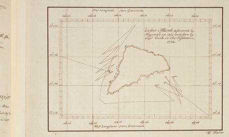
William Wales' map of Easter Island, from Cook's Second Voyage William Wales' map of Easter Island, from Cook's Second Voyage. Source: Cambridge University Library
Key Stage 2 pupils will, we hope, learn about Captain Cook's voyages and Key Stage 3 will be able to think about inventors and enterprise.
For those who feel they are familiar with the story of longitude, having read about John Harrison and his sea clocks in Dava Sobel's Longitude, they will find there is much more to explore. As my NMM colleague, Richard Dunn says,
The archive places the familiar story of Harrison in its richer context. He was a crucial figure but the story is much broader. It takes in the development of astronomy, exploration and technological innovation and creativity during the period of the Industrial Revolution, the work of the first government body devoted to scientific matters, and public reactions to a challenge many considered hopeless.
Simon Schaffer, who leads the research project, adds that
The longitude story is a spectacular example of expert disagreement and public participation. As well as attracting the greatest scientific minds of the day, the board enticed people who belong to one of the most important traditions in British society; the extreme eccentric.
Thus while there may be interest in reading the full story of the Board's dealings with Harrison, eyes are likely to be caught by what were damned by the archive's 19th-century compilers as "Impractical schemes". Some of these are real green ink stuff, with perpetual motion and squaring the circle bound into the seemingly intractable problem of finding longitude.
Scheme for dead reckoning Proposal for finding longitude by determining the ship's rate of sailing. Source: Cambridge University Library
However, there are many other schemes that, while they did not come to fruition, were based on sound ideas. These included improvements to dead reckoning - the educated estimate of position that was not displaced by chronometers until the 20th century - or ways to steady an observer sufficiently to allow them to use Jupiter's satellites as a celestial timekeeper (the standard means of determining longitude on land).
In its later life, the Board supported the two successful methods of finding longitude at sea - chronometer and lunar distance - and broadened its remit into other fields. Thus those who explore the digital archive will also land on geomagnetic research, pendulum experiments measuring gravity, the search for the North-West Passage and a young Michael Faraday pulled in to investigate ways to improve optical glass.
 

Wednesday, July 10, 2013

While Exporting from SDE, "Null Geometry" attack!

During exporting layers from SDE Database (ArcMap 10.1 SP1 for desktop (Build 3143)), to local file geodatabase, the records were exported fine (as I checked the tables) but on the map most of the points didn't appear, for some points are loosing the geometry.
The original layer appears normally on the ArcCatalog, but when exported the error happens.

- Check geometry tool results "null geometry” for the vanished points, "Repair Geometry" didn't solve it.
- Copying Features to a new layer on ArcMap, it copies the features with geometry & deletes the "null geometry".
- Copying the Layer to new file geodatabase (Copy/Paste) gave same error.
- Exporting to Shapefile also gave same error.
- Using XML Export/Import didn't manage the error.

I'm sure there is something related to database, or versioning.
Any suggestions?
Thanks


I got this info from ESRI Support:
Export the SDE layers as XML file, and import that XML file to the local file geodatabase.
Also please make sure you are not falling under following category.
http://support.esri.com/en/knowledgebase/techarticles/detail/41119

Technical Article   Bug:  NIM090672: Specific Microsoft updates may result in data corruption with file geodatabases or shapefiles created on a network share

Article ID:41119
Bug Id:NIM090672
Software: ArcGIS - ArcEditor 9.3.1, 10 ArcGIS - ArcInfo 9.3.1, 10 ArcGIS - ArcView 9.3.1, 10 ArcGIS for Desktop Advanced10.1 ArcGIS for Desktop Standard 10.1 ArcGIS for Desktop Basic 10.1
Platforms: Windows Windows 7, Server 2008 R2

Description

A recent Microsoft update (deployed as KB 2732673, KB 2775511, or KB 2824408) may result in data corruption when using ArcGIS on a Windows 7 system and writing data to remote data storage on a Windows Vista, Windows 7, or a Windows Server 2008/2008 R2 or 2012 system. This data corruption appears as truncation of a write request and has shown up in file geodatabases and shapefiles. 

Additional Information 

An error message referencing the ItemType appears when creating new datasets or items (tables, feature classes, feature datasets, raster datasets, and so forth) in a 10.x file geodatabase created on a network share. 

For example, the following message is displayed when creating a new feature class: 

"Failed to create feature class. 
The item was not found. [ItemType: 
{70737809-852C-4A03-9E22-2CECEA5B9BFA}]" 

File geodatabases created with ArcGIS 9.3.1 return the following error when creating new datasets or items, renaming the file geodatabase, or accessing the geodatabase properties. 

"Failed to connect to database. 
This release of the Geodatabase is either invalid or out of data. [Invalid Geodatabase release]"


Cause

Microsoft has acknowledged the problem, identified the affected component as RDBSS.sys, and provided further details in this Windows SDK Support Team Blog. 

Esri and Microsoft are working closely to understand what has changed in the RDBSS.sys component and how to resolve the problem. 

How Microsoft made these updates available 

KB 2732673 and KB 2824408 are hotfixes to address specific issues. The KB 2775511 update is a cumulative update that is available exclusively through the Windows Update Catalog. 

Because this update is available only through the Windows Update Catalog, the KB 2775511 update is not considered a security update by Microsoft and is not being deployed broadly.


Workaround

• If the patches listed above have not yet been installed, do not install them, per Microsoft's recommendation. 
• If the patches listed above have been installed, Microsoft recommends uninstalling them until a solution is found. 
• Create the file geodatabase or shapefile locally before copying it to the network share. Feature classes can then be created in the file geodatabase on the network share. Note that this is not applicable for raster datasets, attempting to create a raster dataset in the file geodatabase fails on the network share. 
• Create and work with file geodatabases locally. 

Additional Information and Updates 

• June 27, 2013: Microsoft posted an update today on their Windows SDK Support Team Blog. The update states "The hotfix is currently still under development with the update being in testing. The update is on track to be released within the next 60 days (August 2013)." 
• May 22, 2013: Microsoft is in regular communication with Esri and continues to have dedicated development staff working on the issue. A fix has not yet been identified. 
• May 13, 2013: Microsoft has isolated the cause of this issue to an RDBSS.SYS component that was updated by a specific hotfix which is included as part of the Microsoft hotfix rollup KB 2775511. Additional information, including possible workarounds, can be found in this Microsoft Windows SDK Support Team Blog. 
Esri and Microsoft continue to look for a solution to this issue. 
• May 13, 2013: We have confirmed that the same issue occurs when working with shapefiles and results in an error message such as: 
"Error opening feature class 
Number of shapes does not match the number of table records". 
• May 10, 2013: The specific Microsoft hotfix that exposed this issue has been identified. Esri and Microsoft are continuing to dedicate staff full-time to research the cause and provide a resolution as quickly as possible. 
• May 6, 2013: Esri and Microsoft continue to work on this issue with dedicated full-time staff who are in regular, daily communication. These groups are currently working together with a simplified reproducible case. 
• Our testing indicates that the behavior is reproducible with network shares created on Windows systems using the SMB 2.1 and SMB 3.0 protocols. 
• Network shares created on Windows XP (SMB 1.0) and Windows Server 2008 (SMB 2.0) do not encounter this issue. 
• The behavior is encountered when using a network share created on Windows 7 and Windows Server 2008 R2 machines. 
• The issue is also not reproducible when the file geodatabase is created using the file geodatabase API. 
Please contact Esri Support if other behaviors are noticed with new or existing file geodatabases after installing this specific Microsoft rollup.

Sunday, February 3, 2013

Where do smokers live?

Where do smokers live?

By Pam Allison on January 28th, 2013 |                     
According to the American Lung Association, tobacco-caused disease kills more than 392,000 people every year in the U.S., making it the leading cause of preventable death. Another 50,000 people die from exposure to secondhand smoke. The association also notes that in 2004, smoking cost the U.S. more than $193 billion, including $97 billion in lost productivity and $96 billion in direct health care expenditures, or an average of $4,260 per adult smoker. With the implementation of the Patient Protection and Affordable Care Act, states are beginning to address the implications of this important issue.
For example, concerned about projected increases of health care costs, particularly for smokers, Oklahoma State Sen. David Holt, a Republican, is proposing legislation that allows employers to fire cigarette smokers. Current state laws prohibit employers from discriminating against smokers. Holt believes that if people are concerned about losing their jobs, they will stop smoking. He also believes the law will increase productivity and reduce health care costs for people who no longer smoke.
Demographics of U.S. smokers
The CDC claims that in 2010, 19% of all U.S. adults smoked, most of whom smoke less than one pack a day. Where are they? Smokers live in all parts of the U.S. According to Esri, a geographic information systems company, people who smoke less than six packs of cigarettes a week are most likely to live in the Southern and Western U.S. and in Southern Texas.
Click on image to enlarge map.
People who smoke nine or more packs of cigarettes a week are most likely to live in the South.
Click on image to enlarge map.
What type of American is likely to smoke? What type of neighborhoods do they live in? Esri developed the Tapestry Segmentation system that classifies U.S. residential neighborhoods into 65 unique market segments based on socioeconomic and demographic characteristics.
The type of American who likely smokes less than six packs of cigarettes per week is much different from those who might smoke more than nine packs of cigarettes per week. The primary difference is the location of their neighborhoods — urban versus rural.
Residents of City Commons and Urban Rows neighborhoods are twice as likely as the average American to smoke less than six packs of cigarettes a week. City Commons neighborhoods are found primarily in large Southern and Midwestern metropolitan areas. Residents of these neighborhoods are young, single or single parents, live in high-rise apartment buildings, and may be unemployed or work part-time. Urban Rows neighborhoods are found primarily in large Northeastern port cities, with smaller concentrations in the South. Residents are often part of multigenerational households and live in row houses typically built before 1950.
Conversely, residents of Home Town, Rural Bypasses, and Southern Satellites neighborhoods are twice as likely as the average American to smoke nine or more packs of cigarettes a week. Home Town neighborhoods are a mix of singles and families. Residents of these settled, low-density communities are content to stay close to home, so their neighborhoods rarely change. Rural Bypasses neighborhoods are in small Southern towns along back country roads near open space, undeveloped land and farms. Located in the rural South, most of the households in Southern Satellites neighborhoods are comprised of married-couple families. They work in the manufacturing and service industries.
Oklahoma smokers
Holt’s bill is just for the state of Oklahoma. Where do smokers live in the state? If the bill passes, where would businesses and residents be affected the most? Smokers in neighborhoods around larger cities such as Tulsa and Oklahoma City might smoke fewer than six packs of cigarettes a week. Tapestry segments in many of these neighborhoods are City Commons and Modest Income Homes.
Click on image to enlarge map.
Residents of Oklahoma who smoke nine or more packs of cigarettes a week most likely live in rural areas in the eastern part of the state. Tapestry Segmentation classifies many of these neighborhoods as Rural Bypasses, Southern Satellites and Home Town.
Click on image to enlarge map.
Why does this matter?
Knowing where smokers live can help states to target non-smoking campaigns to people who need them the most. While it is unknown whether the proposed legislation will pass in Oklahoma, the desire to decrease smoking is a legitimate concern for all states and government-funded health care programs. Many smoke-related health problems are preventable when people stop smoking, lowering their smoke-related health care costs.
More information about Esri’s data can be found at www.esri.com/data, or to learn more about Esri in general, go to www.esri.com.
Pam Allison is a digital media, marketing strategist and location intelligence consultant. You can visit her blog at www.pamallison.com.